
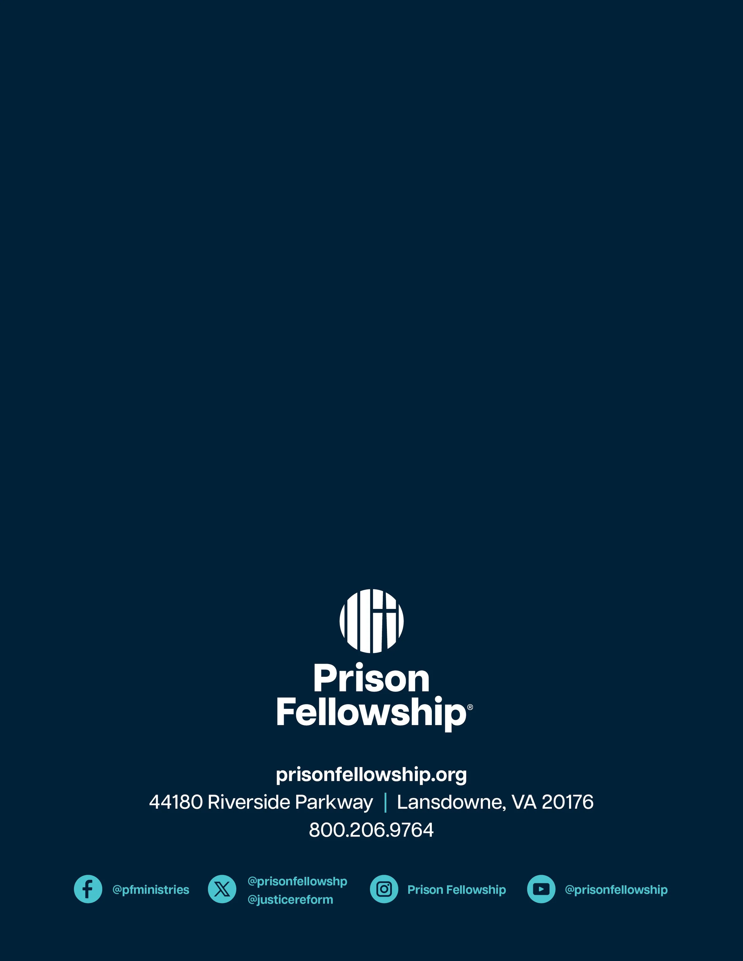
Prison Fellowship Rebrand
Client: Prison Fellowship
Branding, brand guide, illustration
2025

Project
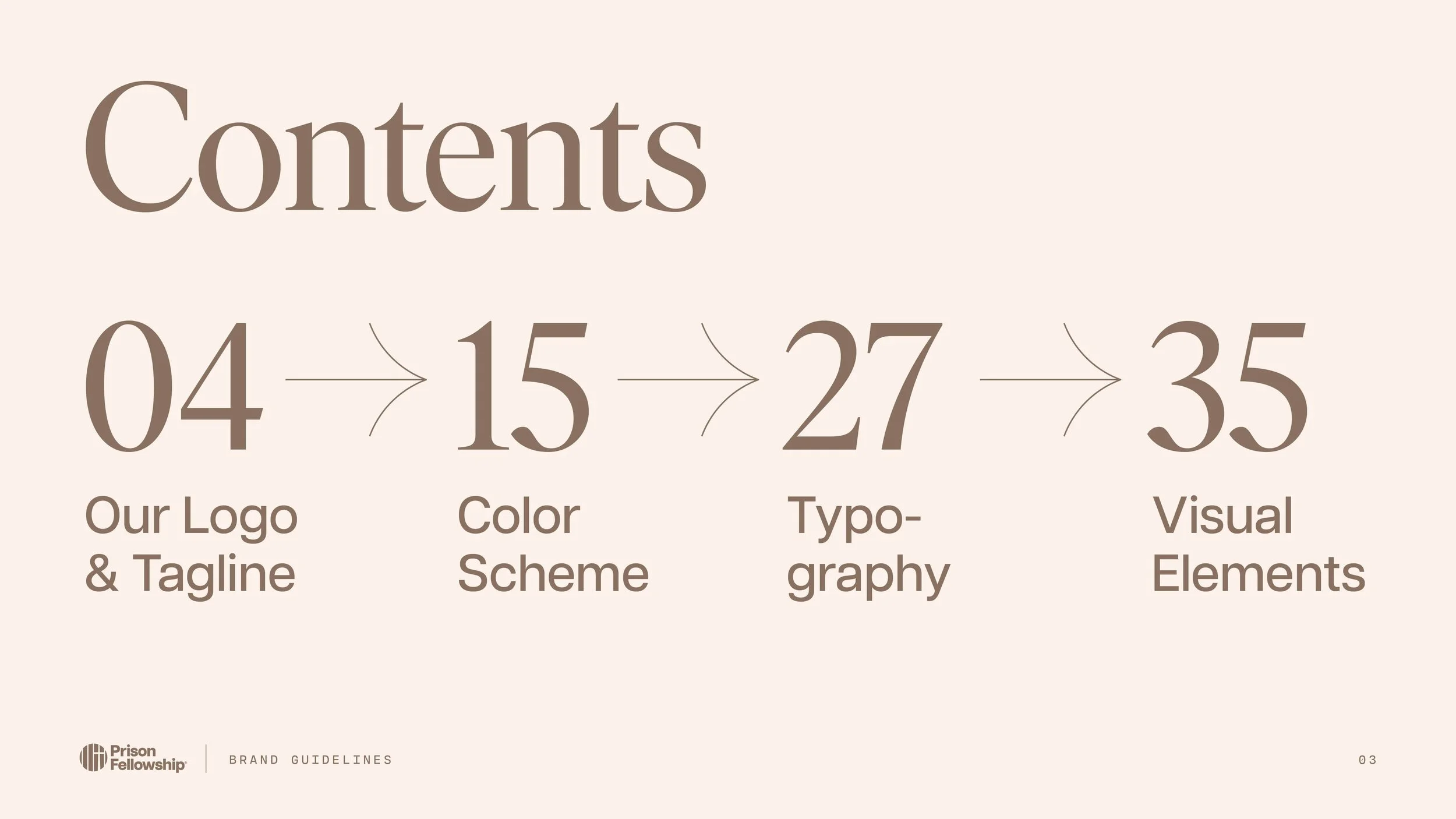
Details
THE WHY
Prison Fellowship is a prison ministry that works to restore America’s criminal justice system. They help men and women replace the cycle of brokenness that landed them in prison. They also work with justice reform, wardens, prisoner’s families and children, and the church.
The rebrand came out of a desire to align more with their new mission and vision. Since working there as an in-house designer for 5+ years, I sought to take the knowledge of things that worked and didn’t work in marketing and translate that over to design solutions.
CREATIVE EXECUTION
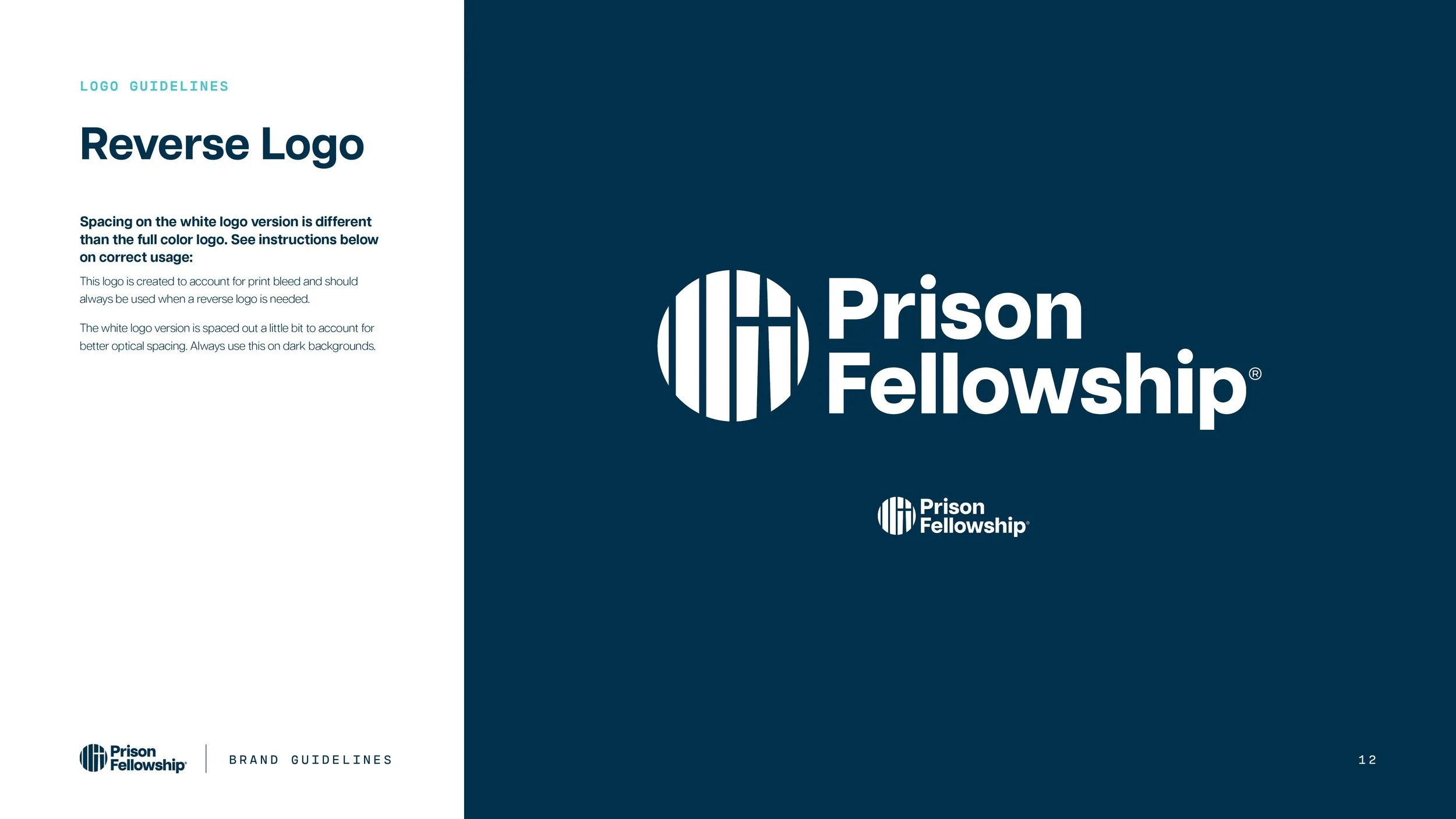
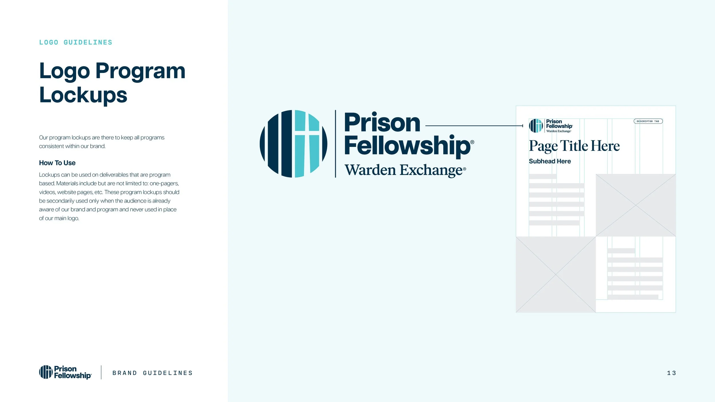
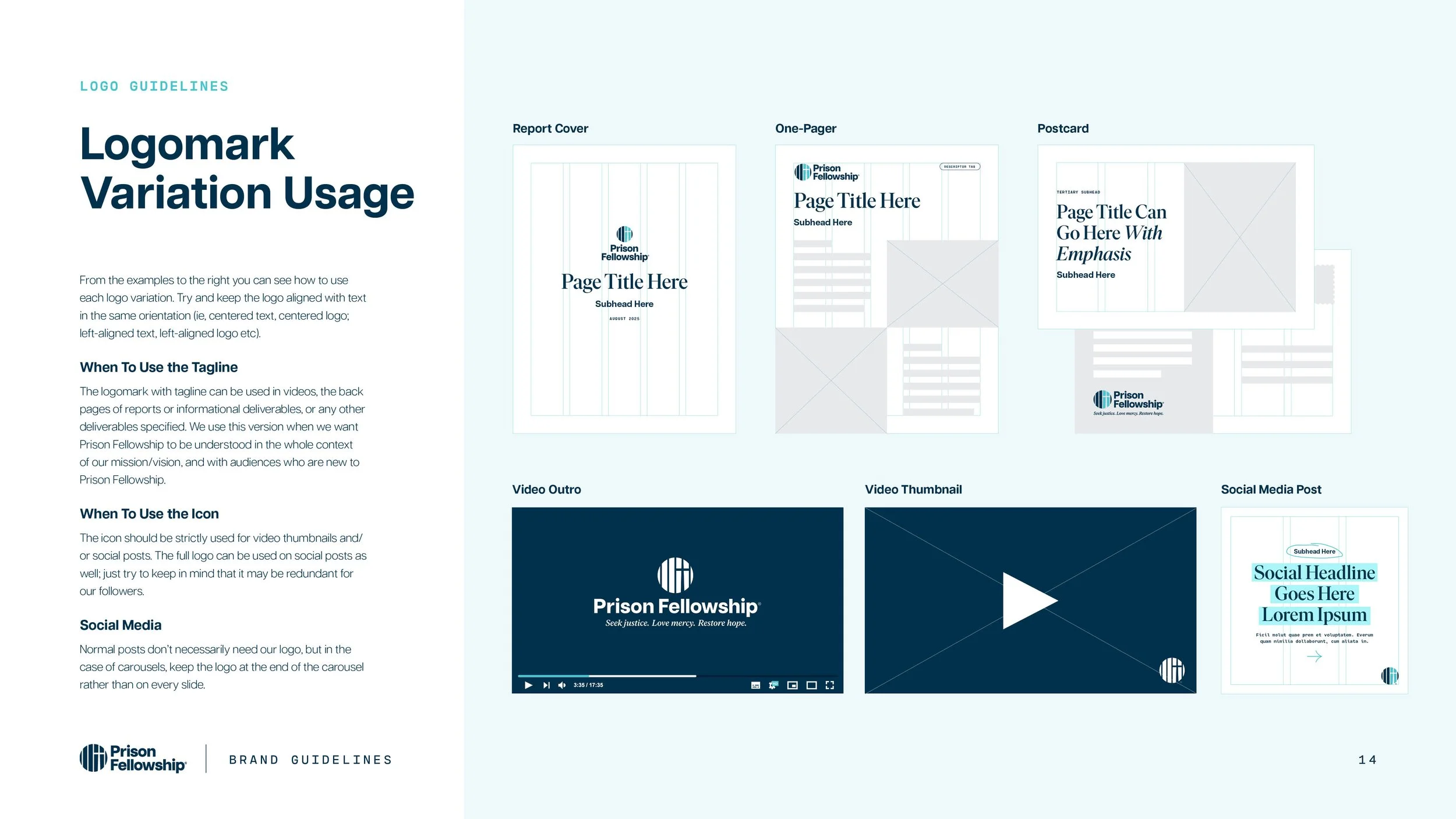
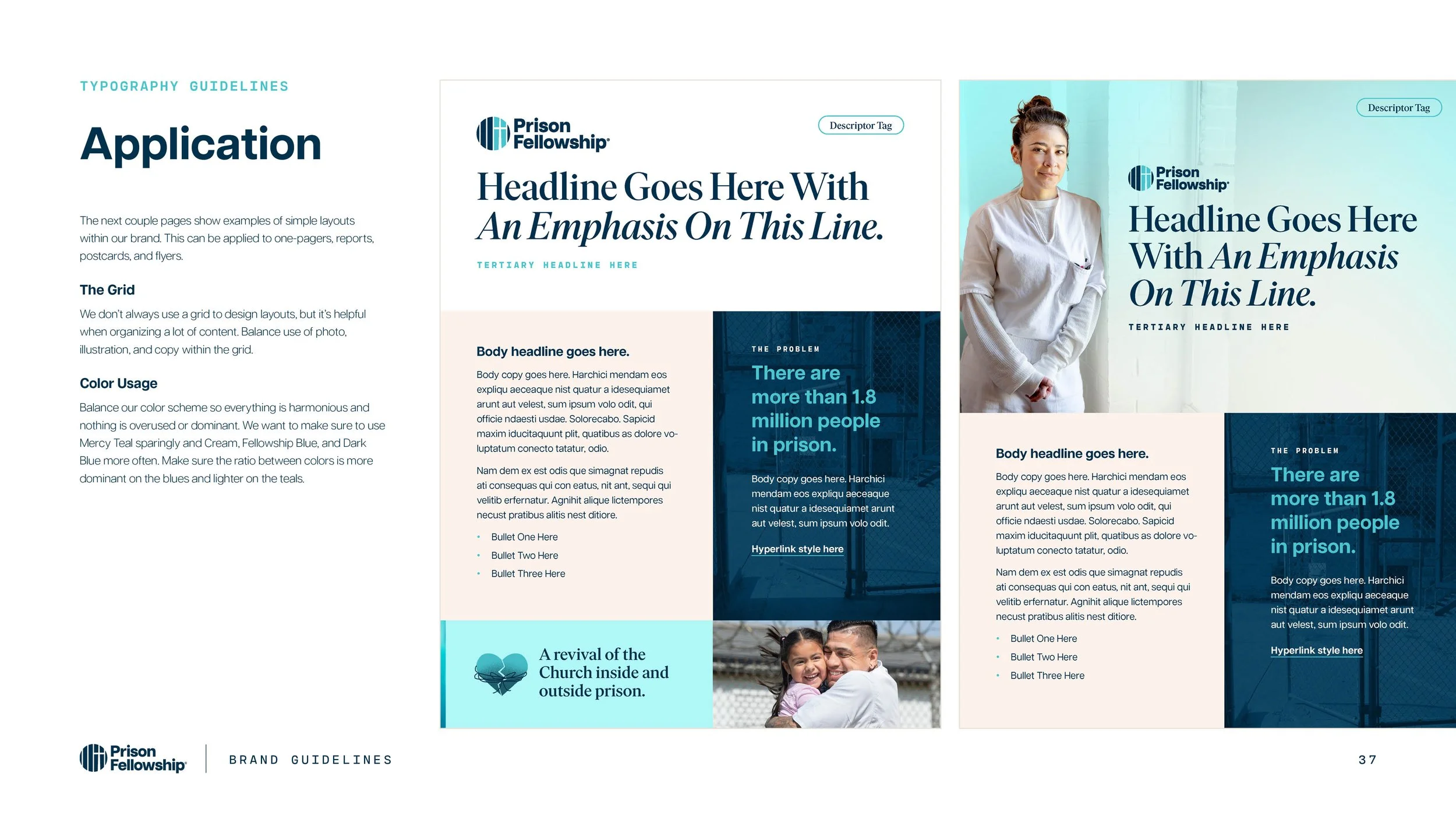
The design team worked to update the new Prison Fellowship logo, and I worked on creating typography, color scheme, layout, and graphic styles. Materials were outdated and didn’t align with the vision: A revival of the Church inside and outside prison that brings justice, mercy, and hope to our culture.
I sought to make graphics more conceptual and personal, as well as a reflection of how Prison Fellowship sees those impacted by incarceration: made in God’s image and transformed by the power of Jesus Christ.

Prison Fellowship believes that a restorative approach to those impacted by incarceration can make communities safer and healthier.


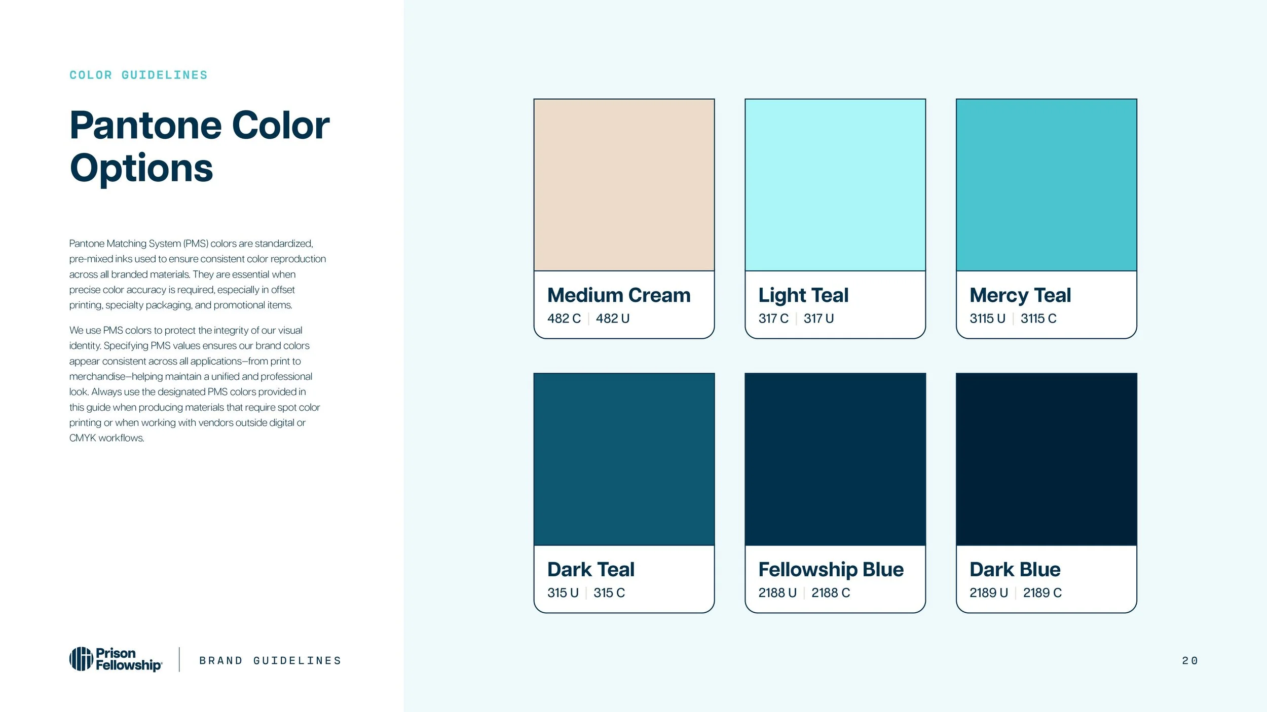
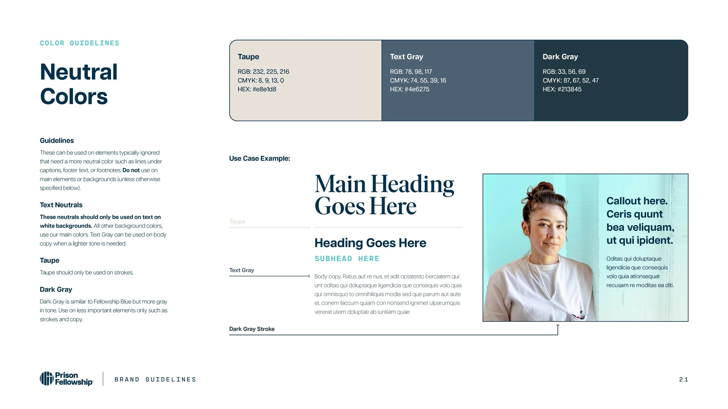


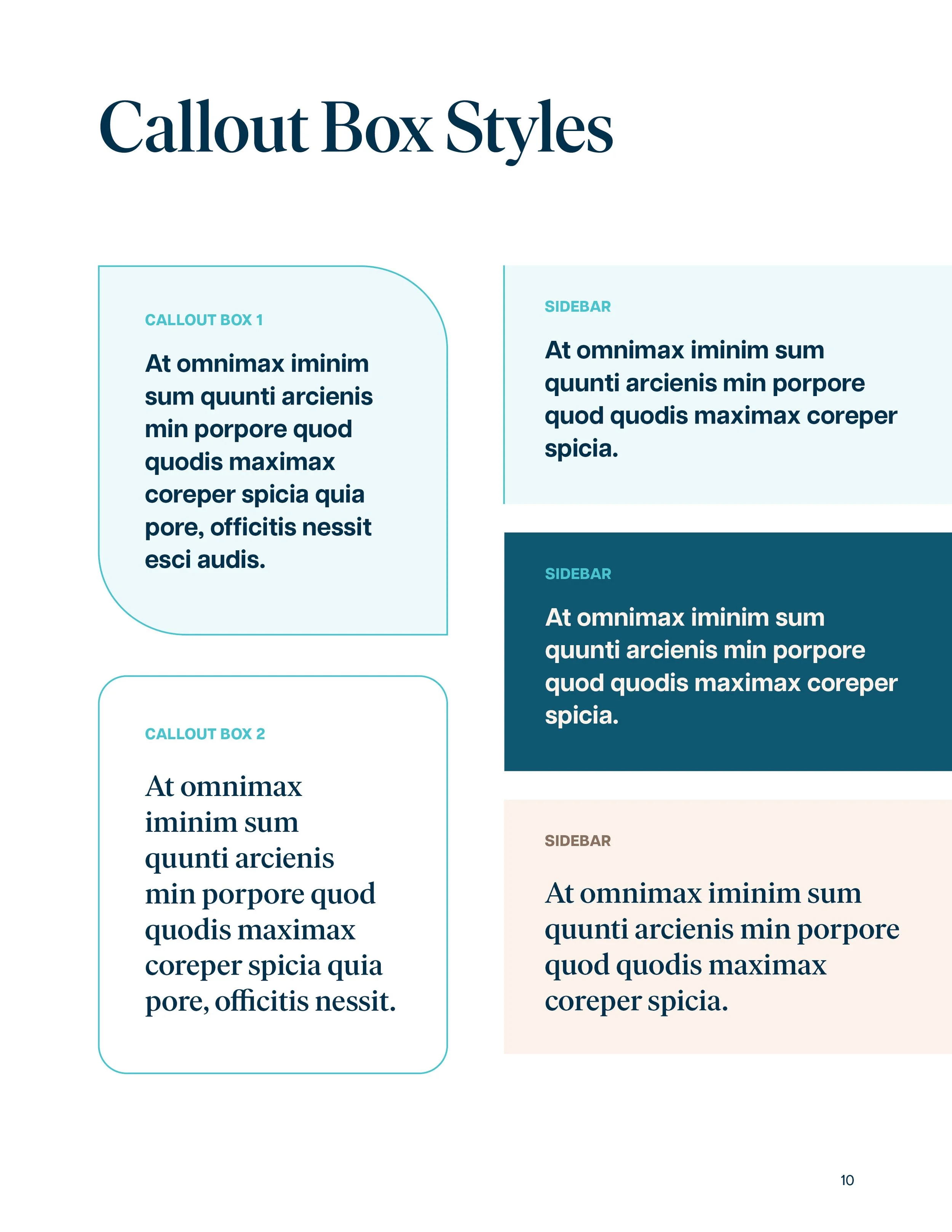
Color Scheme
I refreshed the color scheme with more contrast. Since it is heavily a cool-toned brand, the addition of cream added a warmer feel.
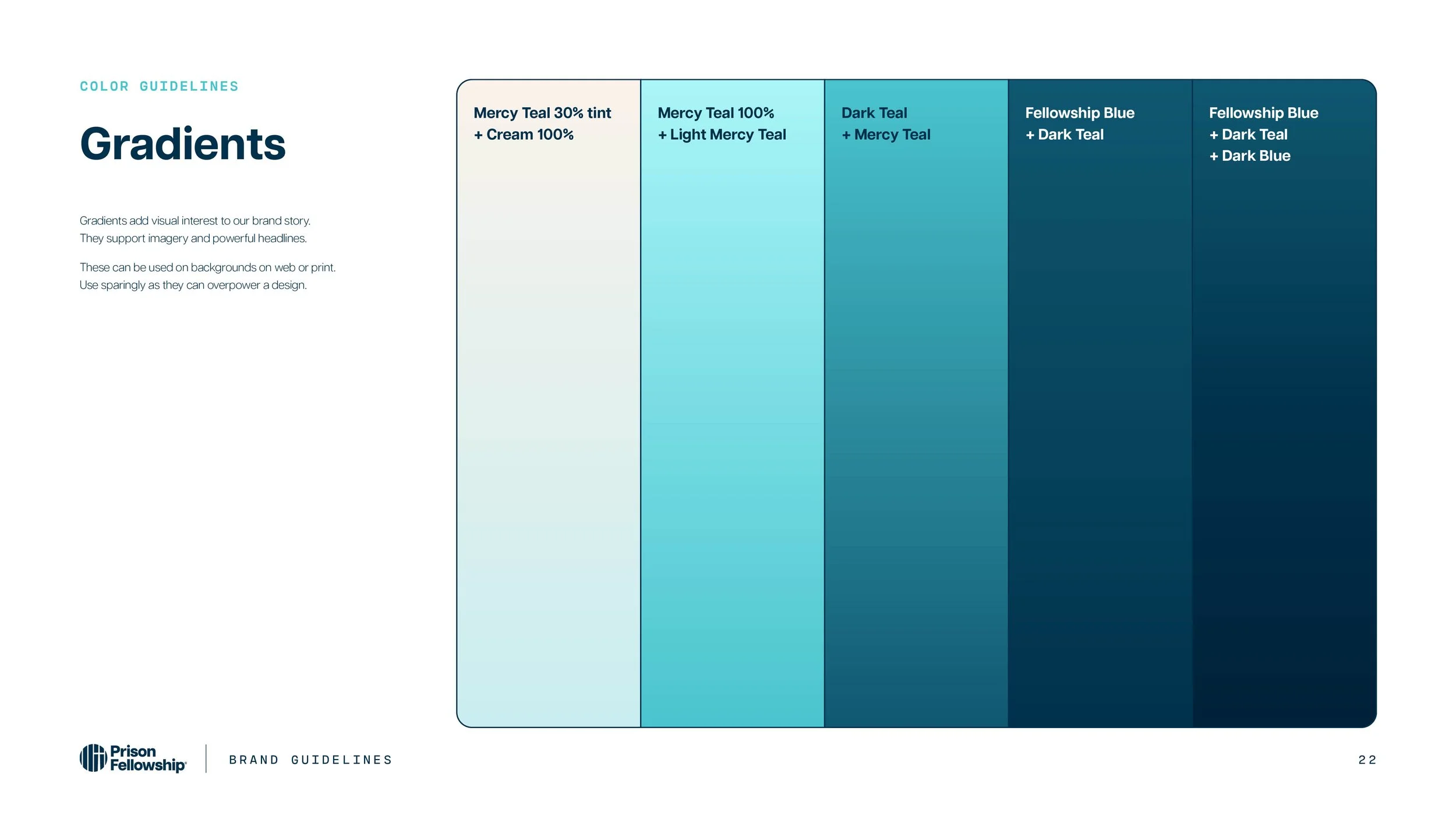
I also experimented with what color stories could look like, as well as gradients and data visualization.


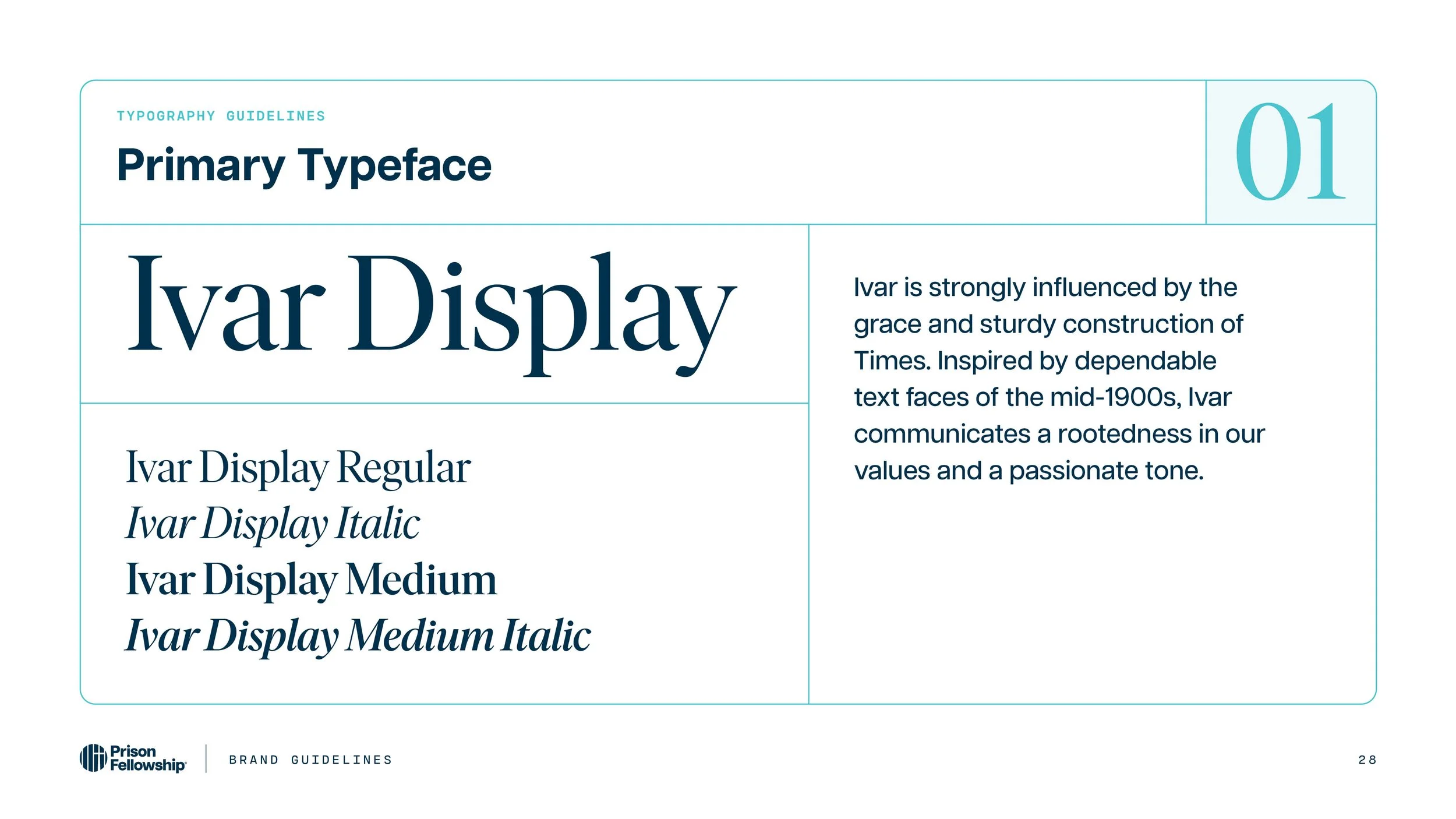
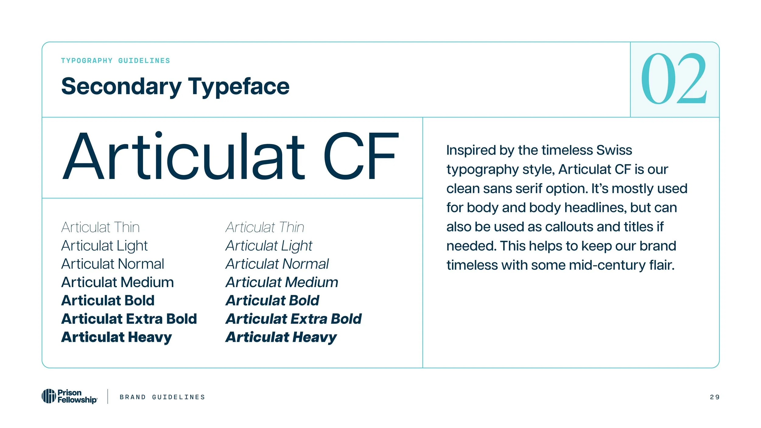
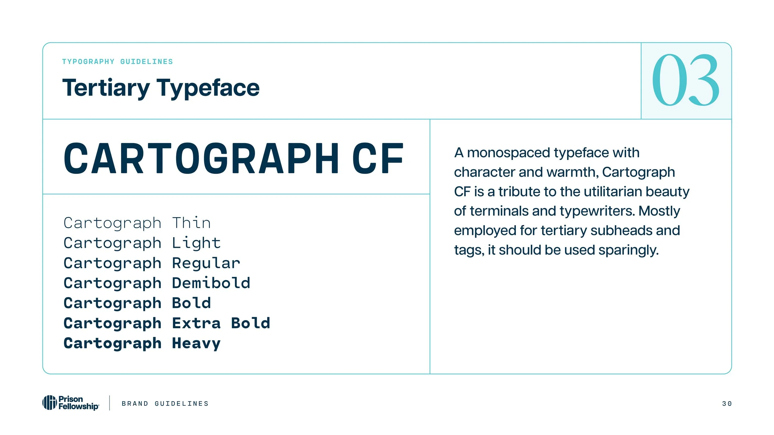
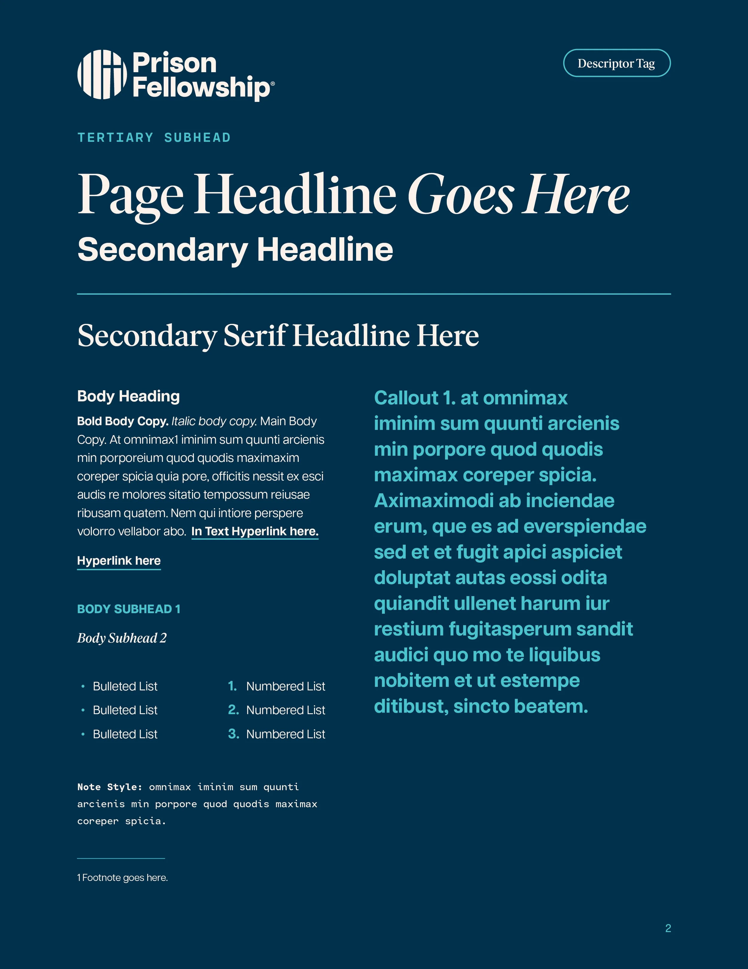
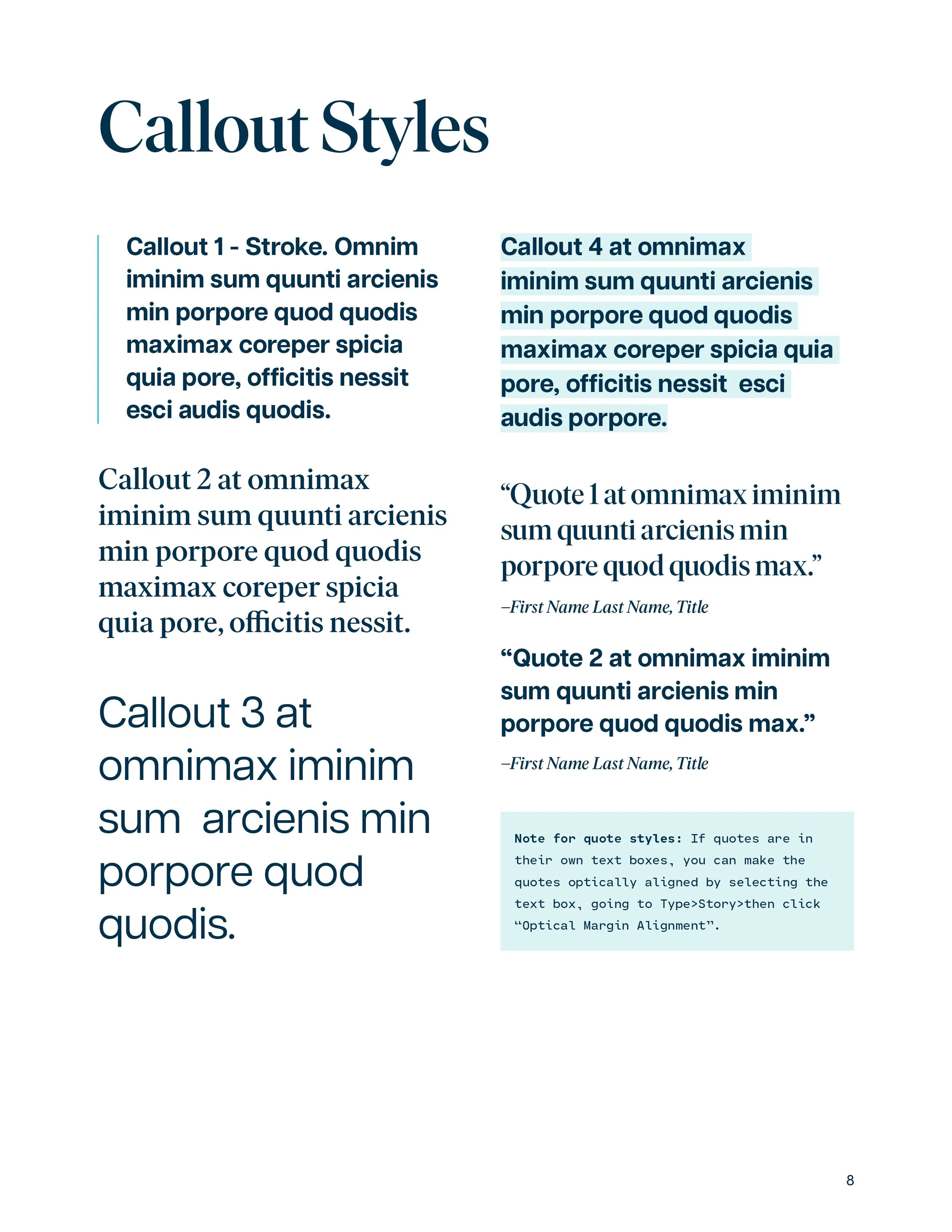
Typography
Historically, the brand overused sans serif fonts so we wanted to find a good serif headline font that was a bit more serious than our old font.


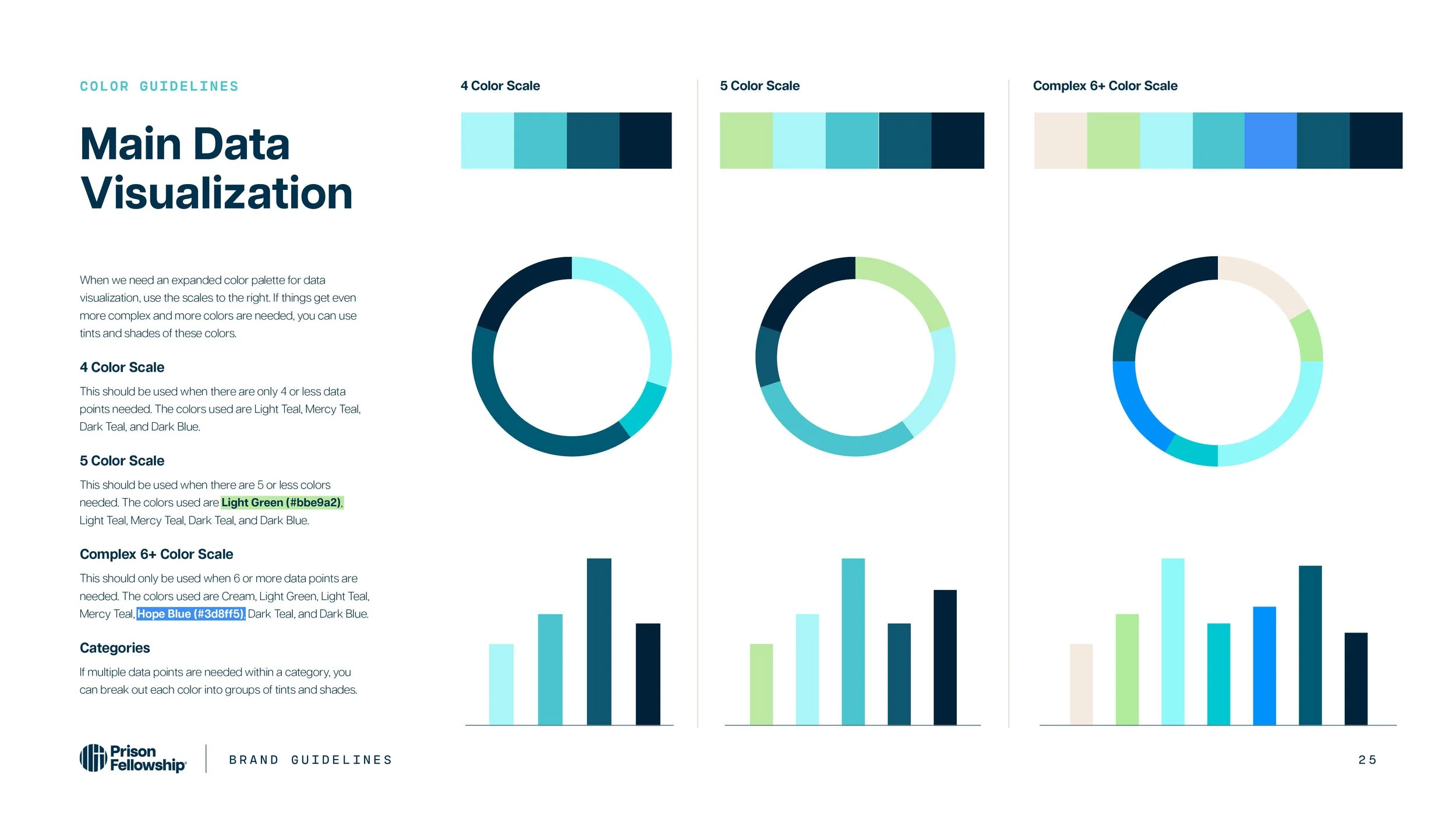
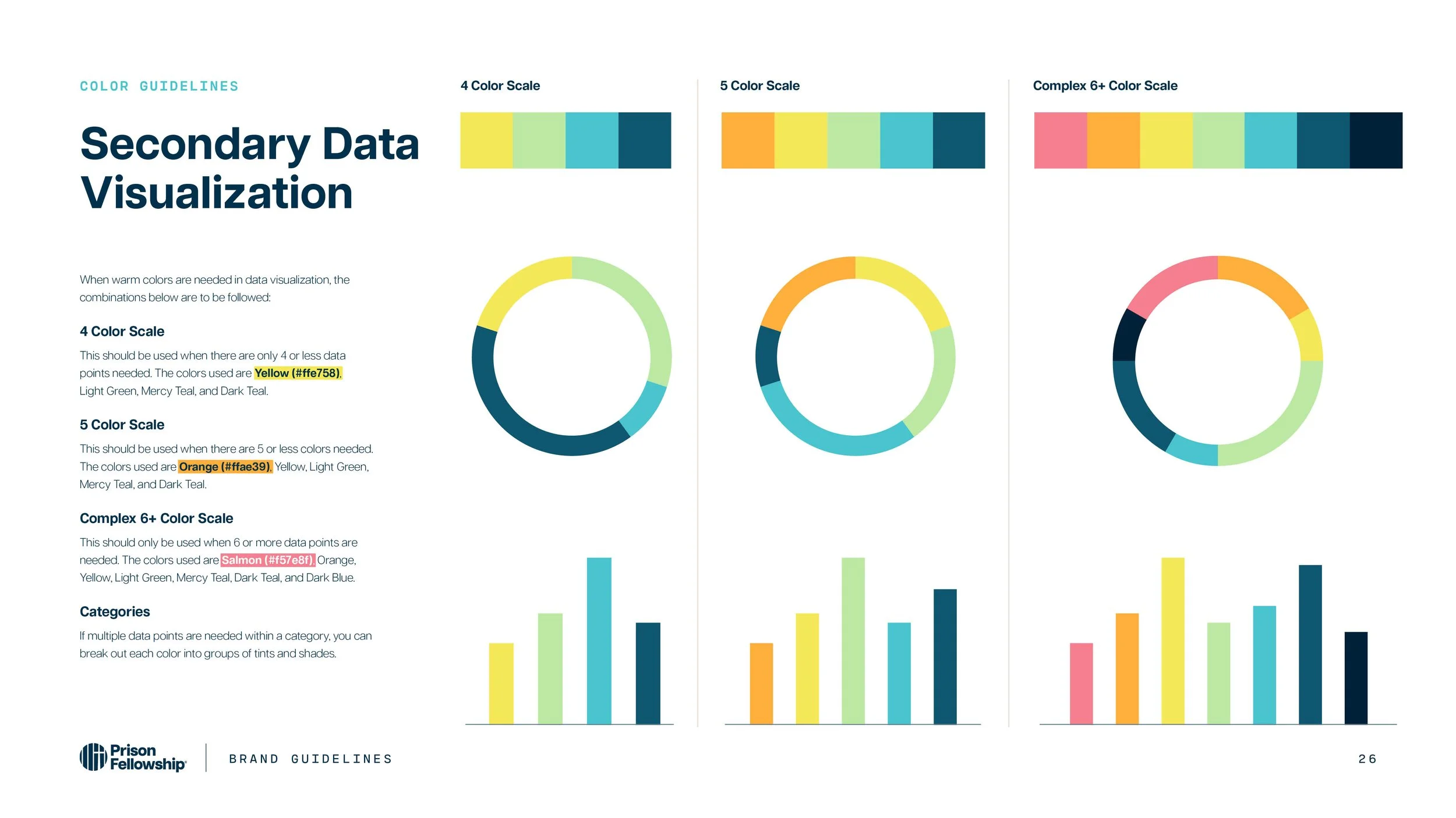
Data Visualization
Since Prison Fellowship is also known to use statistics in reports and graphics, I created expanded color palettes for charts and graphs based in cool or warm toned schemes.

Illustrations
I chose to create an illustration style that was vector based with hand drawn elements + texture. I thought it gave a more personal feel to it, since Prison Fellowship works with statistics related to incarceration.


Styles & Templates
To keep branding consistent across all channels, I created InDesign styles, PowerPoint, and Word document templates.


Angel Tree Exploration
This was an exploration into how a program could look depending on the campaign. I explored adding a red into the color scheme just for Angel Tree Christmas.


